
Disclaimer:
This article was written with Drupal 8 still under very active development; if something don’t work… maybe you can fix it.
 With the release of Drupal 8, themers will be showered with pleasant surprises.
For starters, the theming engine has been changed from PHPTemplate to Twig. And while we were fixing that little issue, we also modernized the CSS architecture, removed all theme functions, shuttled control of markup and CSS into the theme, and added image styles, breakpoints, and responsive images.
Were you ever confused about where certain markup came from? Guess what: it’s now visible by viewing the page source.
Welcome to the epic world of Drupal 8 Theming: powered by a fearless horde of Norsemen and Shield Maidens! riding on mighty Unicorns! in the full moon! under the banner of Drupal 8! onwards to victory!
Or just a really delightful theming experience.
First Blood
Let’s start with a Drupal 8 theme. Create a new folder in [root]/themes/[themename]. This will make it available to all sites in your installation. For a site-specific theme, you could place it in sites/[sitename]/theme as is done in Drupal 7.
To register the theme, Drupal needs a .info file. That file must be placed inside the theme folder theme/[themename]/[themename].info.yml, and have the following contents:
name: yggdrasil
type: theme
description: A mighty theme
package: themes
core: 8.x
screenshot: yggdrasil.gif

base theme: classy

libraries:
  - yggdrasil/global

stylesheets-remove: stylesheet-i-dont-need.css
stylesheets-overwrite:  stylesheet-i-overwrite.css

regions:
    header: Header
    content: Main Content
    footer: Footer
Let’s break down each part of the .info file.
Theme Definition
The first part of the info file defines the basic information of the theme, its name, core version, and an image.
Base Theme
This is one of the “small” things that has changed with Drupal 8. It defines how Drupal gets its markup and classes. In Drupal 7, core came with the templates: if you wanted to change those, you would overwrite a template file or a theme function. Sometimes, the markup even came pre-rendered.
Drupal 8 has been built from the ground up with the bare minimum of CSS and markup. Only what’s needed for core functionality is added to the core template files; everything else is added to the new Classy theme. (If you don’t add a base theme, your site will still work with core functionality, but with a bare minimum of markup.)
The Classiest Theme Ever Created
The role of the Classy theme is to provide default markup and CSS for Drupal. Classy provides a rock-solid markup and CSS combination built on modern concepts; BEM and SMACSS devotees will feel right at home.
That gives themers and module developers a common ground to build on, while not locking down those who want to develop new frontend frameworks (which can now be done without having to battle with Drupal’s default markup).
So fans of insert-your-favorite-css-framework can create a theme with little or no headache.
Libraries
A new concept for a theme is “libraries.” Without getting too technical, this is where you add CSS and JS files.
Libraries can be activated for specific pages, and you can enable or disable Javascript files as needed. Don’t get confused by the name “library”: your CSS is still just a CSS file, it didn’t go all Dewey-Decimal wimp, with horn-rimmed glasses and a hankering for claret and beat poetry.
In the theme’s .info file, we define the libraries we’re going to use. In this case were setting a “global” library: yggdrasil/global.
Now our theme needs a library file: [themename].libraries.yml. We’ll create one with the following contents:
global:
  version: 1.x
  css:
    theme:
      css/style.css: {}
      css/print.css: { media: print }
  js:
    js/style.js: {}
  dependencies:
    - core/jquery
Let’s take a closer look at what’s being defined here.
CSS
The “global” library will add the CSS files css/style.css and css/print.css. We can optionally add media queries like {media: print}, so if you fancy writing media queries at the file level, this is where you do it.
Javascript
Javascript gets added the same way as CSS. And as a bonus, there are dependencies, which means that if your theme requires jQuery, you have to define it. If jQuery isn’t defined, it won’t be in your theme (until a module needs it). Yes I know you will miss the 32K of love that was added to every page. Sorry.
For more information on including CSS and JS in a theme, see http://wdog.it/5/1/add
Removing and Overwriting CSS Files
If a module provides a CSS file that you don’t have any need for, it can easily be removed by using the stylesheets-remove configuration setting. (Some of my loyal fans might remember this as the FOAD method, as described in my “Angry Themer” column from Drupal Watchdog Vol. 3, Issue 1: http://wdog.it/5/1/foad).
For example, you can remove a CSS file by adding the following to your [themename].libraries.yml file:
stylesheets-remove: stylesheet-i-dont-need.css
Stylesheets provided by modules in Drupal 8 follow the “Module-Admin-Theme” (“MAT”) name pattern, that makes it much easier to figure out what is contained in the various CSS files:
[modulename].module.css - contains functional essential CSS
[modulename].admin.css - CSS for the admin interface
[modulename].theme.css - the colors, padding, etc.
That makes it child’s play for the themer to remove all the colors and padding in *.theme.css from a module without the risk of breaking functionality, which is now separated out in the *.module.css file.
To keep a module’s CSS file, but overwrite it with a the theme’s local CSS file, you can use stylesheets-overwrite:
stylesheets-overwrite: node.theme.css
Debugging is Fun
Now we’re ready to enable the theme. Load up your Drupal 8 site, find a template and let’s make some magic!
Trying to figure out where the markup comes from has always been a thorny issue: was it a function, a template, or an act of the Drupal gods? Sure, the Devel module solved some of these problems, but it was still tedious work.
In Drupal 8, we have theme debugging built into core. To enable debug, go to the services file (sites/default/services.yml). There you’ll find the Twig settings, which makes it a snap to enable debug mode:
twig.config:
debug: true
auto_reload: true
cache: false
After setting debug: true, clear the cache and do a view-source on your site; you should see comments, as shown in the following screenshot:
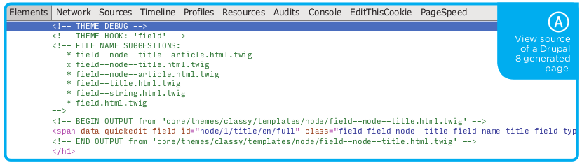
Debugging comments include:
- theme hook: which hooks are in use.
- filename suggestions: the little X on the suggestions tells you which of the templates are in use, and gives suggestions to filenames that can overwrite this template.
- path: tells where on the filesystem the template is located, For example:
core/themes/classy/templates/node/field--node--title.html.twig
If you want to take debugging to the next level, download the Devel module and use kint on the variables in the template files to get more info: {{ kint(variablename) }}
CSS
CSS has changed a lot over the last couple of years. One of the hard truths in a CMS is that it’s almost impossible to keep up with what happens in the frontend. (Responsive, anyone?)
We changed Drupal 8 CSS documentation to build on SMACC & BEM principles, but we can’t pretend that those principles will live on forever. So, instead of Drupal assuming what a theme(r) needs from CSS classes and hiding that information deep away inside a function, the control is now flipped around to the theme.
In Drupal 8, it’s the template that defines what class names are used. A module can still provide suggestions, but the classes are controlled from the template file.
Lets take a look at the node template, node.html.twig:
{%
  set classes = [
    'node',
    'node--type-' ~ node.bundle|clean_class,
    node.isPromoted() ? 'node--promoted',
    node.isSticky() ? 'node--sticky',
    not node.isPublished() ? 'node--unpublished',
    view_mode ? 'node--view-mode-' ~ view_mode|clean_class,
  ]
%}

...
At the top of the file is a Twig variable set called classes, which is then added to the attributes for the article tag with .addClasses().
When the template is rendered here, the classes will be added to the attributes and printed out:
We can manipulate the default classes and only print out what’s needed with the information that Drupal gives us.
- string:
'node'(set ‘node’ as a class) - tilde:
'node--type-' ~ node.bundle|clean_classThe tilde (~) adds to the string -- in this case, thenode.bundle(aka content type) and makes sure that it’s correctly formatted with the|clean_classfilter. - if:
node.isSticky() ? 'node--sticky',If the node hasisStickyset to true, then we addnode—stickyto classes. - not:
not node.isPublished() ? 'node--unpublished',Now we ask the node: if it’s published. If it’s NOT, then add thenode—unpublishedclass.
red, you can remove it from your classes by using .removeClass(‘red’), like this:
Remember, if you’re adding classes that are used for Javascript functionality, prefix it with js-. That way, it’s easy to understand what a class is used for. If a file is named .js-something, then we know it’s not used for colors but for some magical Javascript stuff. (You should really use data-attributes, but I’ll save that for another article.)
Images — Now Also Responsive
With the help of configuration management, we can now pack the theme with predefined image styles: first, configure the image styles in normal fashion; then, export the configurations to the theme (found at Configuration » Configuration Management » Export).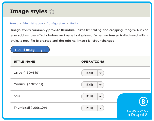
To export your image styles, create a file with its correct style name (image.style.[stylename].yml) and paste in the content from the export form.
The file should then be saved in your theme’s configuration directory, [themename]/config/install/.

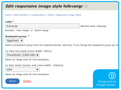
Breakpoint and Responsive Images
Okay, so now the theme has images, but lets make them responsive. First, we need to define the breakpoints for our theme, and that goes in the file [themename].breakpoints.yml:
yggdrasil.tiny:
  label: Very tiny style
  mediaQuery: '(min-width: 0em)'
  weight: 0
  multipliers:
    - 1x

yggdrasil.epic:
  label: Epic sized
  mediaQuery: 'screen and (min-width: 120em)'
  weight: 2
  multipliers:
    - 1x
For more information on breakpoints, see http://wdog.it/5/1/bp
Now we can map the breakpoints to image styles by creating a new responsive image style at Admin » Config » Responsive Image.
Awesome Level 9000
If all this wasn’t enough to make you smile, then remember those questions that once induced throes of terror in the spine of every themer: “Can we change the markup of the main menu, but not the other menus?” Or, “Can you fix the pagers markup?”
Now you know how to find them and, yes, there’s just one template file for each.
And so, this fearless Viking mounts his mighty Unicorn, in the full moon, as his Shield Maiden smashes her Battle Ax against some hapless template files.
See you in the sourcecode.
/mortendk
... a much-less-angry themer
Twig Crash Course in Four Lines!
{{ prints a variable }}
{% set varible-that-we-can-use %}
{# comments #}
{% if something %}
For more, see my past article, “Gettin' Twiggy With It,” where I covered the basics of Twig