When I was fourteen years old, before there was such a thing as the World Wide Web, Bob the Art Teacher gave me an assignment: create a design using only squares on a page. I wish I still had the design so I could show it to you now. On a sheet of paper no bigger than this magazine page, I drew at least thirty boxes of various sizes and dimensions. They weren't scattered per se, but there wasn't much rhythm to the page either. I got a bad mark on that assignment for not making the boxes line up. I tried to justify it by showing how some of the boxes did line up, if you drew imaginary lines through the middle of some of the in-between boxes, but it was a weak argument and I knew it. Yes, easy-going Bob, who liked to be called by his first name, busted my butt for not using a grid.
Why Use a Grid System?
Grid systems were originally based on the size of the printed page. They used artificial constraints to break up the page in a pleasing manner, putting content in the center, surrounded by a border that was related to the size of the page. Maths were involved and they helped designers answer commonly asked questions like, "How wide should this page element be so that the whole page looks balanced?" Designers were trained in the use of grids, with the height of grid-based design being in the 1980s, before the masses had access to desktop publishing programs on their desktop computers.
Except the Web isn't the printed page. (This may shock some of your clients, I know.) The browser window is fluid. It can be as small as 300 pixels on a mobile device and wider than 1200 pixels on a desktop. So why use a grid system at all? Using a grid as the base for your design puts good constraints on your page elements, helps you create a visual hierarchy, and guides viewers as they scan each page element in search of the piece of content they're looking for. Grids force us to think about the relationships between page elements and how they fit together. Grids can even help us reduce the screen size by either narrowing the grid (the flexible responsive grid), or adapting the number of columns visible in the viewport (a cheap retrofit that's easy to implement).
By using a CSS grid framework, you also allow a whole community of designers and developers to help you with cross-browser compatibility. In short: using a grid system allows you to create better designs with less effort.
How To Use Grids
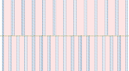
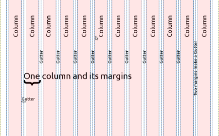
By their very nature grids are rigid. In print, grids will have both a horizontal and a vertical rhythm. On the Web it is more difficult to predict font sizes used by each site visitor, and so we tend to see columns, and not rows. These columns provide us with an easy-t0-follow guide for placing content on our site with strict widths, but flexible heights. The next figure shows the three shapes you need to be aware of in a grid: columns, gutters and margins. Columns can only exist if there is space between them to show you the boundaries where one column ends and the next column starts. The space between each of the columns is referred to as the gutter. Around the entire design is an additional, calculated space which separates the edge of the content from the edge of the container (browser window). This outer space, referred to as the margin, is half the width of the gutter. This is because the margin exists both on the left and right side of the column. When two margins butt against one another they create a double-wide space—the gutter.
The grid system described in this article is the 960gs. It is used by many popular base themes including NineSixty, Fusion and Omega. These base themes come with their own Drupalized version of 960gs.
Go ahead and download the framework kit from the 960gs Website. It includes sketch sheets (yes, for drawing wireframes on paper), templates for your favorite graphics application, and the CSS files we'll be using in the remainder of this article.
Choosing Column: 12 or 16
The first step in designing a site with the 960gs is to choose whether you want your page divided into 12 columns or 16 columns. The total width of the page will not be affected by the number of columns used. These columns can be grouped together to create regions on your Web page. Choosing between a 12- or 16-column grid does not affect the total width of the page.

These regions can be filled by sidebars, content, advertisements, or whatever else your Website needs to display. To help decide which grid to use, look for known constraints. If there is no obvious choice, start with 12 columns—you can always change your mind later. Remember my Freshman year art project and use constraints to guide the eye around the page; too many columns in your design make it more difficult for visitors to orient themselves on your Web page.
Filling in Regions
In my experience, graphic designers find it a welcome relief to work within the constraints of a grid framework, and themes are faster to build when matching up a design to the code in an established CSS grid framework. If, however, you don't have the luxury of a graphic designer or themer on your team, you can still make use of grid frameworks to design your Web pages.
Using an appropriate template from the 960gs kit, add each of your page elements into the grid. Use as much detail as possible to give yourself a good sense of how crowded your pages will be. Organize the page elements to create visual hierarchy. Put the most important page element near the top left of the page (assuming a left-to-right language site). Group similar elements.
If your grid is too full you may need to shuffle your template so that you have room to make your pages beautiful instead of just jammed with content. And if your pages have every available pixel used up, ask yourself, "Does this design point visitors where to look first?" This was the lesson I missed twenty years ago in art class: don't just slap objects on a page. Carefully plan your page layouts by using a grid to guide your designs.
Using the 960 Grid Framework
To use the 960gs you need to know about the following HTML concepts:
- To create a square container of any size you need to use <div class="container-12"> OR <div class="container-16">. By default a container will use up 100% of the available width it is contained in; however, it will only be as tall as the content it contains.
- Inside your container you may have as many columns as you like. Each of these columns will probably use a <div> as well. There is no requirement to use a <div>. To adjust the width of a column inside of a container (usually a <div>), add a class with the number of grid columns you want to assign as the width. For example: <div class="grid-6">
- Each new container represents a new row in the layout and may have any combination of columns that you like. For example: content row has 2 columns; but the footer row has 4 columns.
- Containers may have multiple styles applied to them, separated by a space. For example: <div class="grid-6 clear-block">
- Containers may also have a unique identifier applied to them. This is especially useful if you need to apply unique styles to only that region on the page. For example: <div class="grid-6" id="sidebar-left">
With these simple rules, and a bit of magic, you can create a Web site template using the 960gs.
Building Wire Frames with 960gs and HTML
This is the most basic page Drupal will output; we'll use it as our template even though we'll be working in plain HTML for this article:
"<a href="http://www.w3.org/MarkUp/DTD/xhtml-rdfa-1.dtd">
<html">http://www.w3.org/MarkUp/DTD/xhtml-rdfa-1.dtd">
<html</a> xmlns="<a href="http://www.w3.org/1999/xhtml">
">http://www.w3.org/1999/xhtml">
</a> <head>
<title></title>
</head>
<body>
</body>
</html>
To this very simple template, add the CSS Grid Framework files by adding the following HTML snippet on a new line, directly below the title (inside the <head></head> tags):
<link rel="stylesheet" href="//www.drupalwatchdog.net/css/text.css" />
<link rel="stylesheet" href="//www.drupalwatchdog.net/css/960.css" />
Change the file name to match the location of your 960gs files on your computer. Once this is complete you are ready to start working with the grid system. The remainder of this section will show only the HTML that needs to appear between the two body tags.
Warning!
The 960gs uses an underscore ( _ ) instead of a dash ( - ). You will need to adjust your class assignments accordingly. The dash is used here because the NineSixty theme has changed the style names to match the Drupal coding standards guide. If you are working in the plain HTML version with the original 960gs CSS files, change all class names to use an underscore. If you are extending this article and creating a Drupal theme with NineSixty as your base theme, use the dash, as shown in this article.
Creating the Container
The 960gs comes in two flavors: 12 column and 16 column. To begin working with the grid system you must specify which of these two systems you want to use. This is done by creating a new container as follows:
<!-- new shapes will be placed inside this container -->
</div>
Assuming the whole Web site will be contained in the same shape, you will only need to make this declaration once. If you want your container to include browser wall-to-wall coloring, you will need to use a wrapper which isn't constrained by a 960gs container. For example:
<!-- This container is outside of the grid framework. -->
<!-- It will extend the full width of the browser window. -->
<div class="container-12">
<!-- This shape is only 12 units = 960px wide. -->
</div>
</div>
Adding Page Elements
Working from the top left corner of your design file, create a new HTML div for each box in your wireframe. To the
<div class="grid-12"><!-- header row --></div>
<div class="grid-8"><!-- content column --></div>
<div class="grid-4"><!-- sidebar column --></div>
</div>
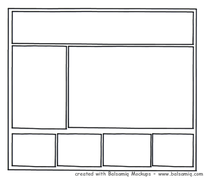
I've added a few extra styles to punch up the shapes and make them easier to spot; however, this simple snippet of HTML will display as follows:

Note that the header is on the first "row" and the "content" and "sidebar" appear on the second row. Once the numbers in the grid classes equal the container number, a new row will automatically be created. Each row may be divided however you like. Perhaps you'd like the sidebar to appear before the content? What about a footer too, please?

No problem! The HTML snippet for this example would be as follows:
<!-- header row -->
<div class="grid-12"><!-- header row --></div>
<!-- content -->
<div class="grid-4"><!-- sidebar column --></div>
<div class="grid-8"><!-- content column --></div>
<!-- footer menus -->
<div class="grid-3"><!-- outer left footer --></div>
<div class="grid-3"><!-- inner left footer --></div>
<div class="grid-3"><!-- inner right footer --></div>
<div class="grid-3"><!-- outer right footer --></div>
</div>
Content First
Using the 960gs you may easily reorder your content so that the navigation appears after the main content in the source of your document. To swap positions you must use a push-pull technique to change the location of the page elements. For example, if you wanted the content to appear to search engines before the sidebar you would need to complete the following steps:
- Invert the position of the content and sidebar areas in the HTML source.
- Use CSS classes to pull the sidebar back over to the left visually and push the content away from the left.
The snippet would be as follows:
<div class="grid-8 push-4"><!-- content column --></div>
<div class="grid-4 pull-8"><!-- sidebar column --></div>
A push-pull swap in the 960gs must always be performed in pairs—as one region is moved to the right, another must take its place by shifting to the left. The README in the NineSixty base theme covers more examples of how to use this great grid framework (including nested columns for even more control of your layout).
Muck around with the design files in plain HTML to familiarize yourself with the ins and outs of using a grid-based layout.
Converting Your Grid Layout to a Theme
Once you've got a plain HTML page working the way you want, it's a trivial matter to break up the page and place each of the components into a relevant theme tpl.php file. Generally I advocate building from design straight into a Drupal theme, omitting the flat HTML phase, but we're just mucking about here, so it's perfectly acceptable to further distort your HTML files into a Drupal theme just to see how everything fits together.
If you've made a few Drupal themes already, you probably know how to break apart an HTML file and add the relevant Drupal variables. If it's your first time working with a grid system, use NineSixty as your base theme. The README file does a good job of explaining the basics in a Drupal context. Your next step is to take a look at the two NineSixty sub-themes Domicile and Vert. I created these two themes to teach new themers how to build new grid-based themes for the very first time. They contain just enough code to convert a simple design into a basic theme. Download 'em, poke at 'em, and if you've got questions, post ‘em in the issue queue! You can even hack at them and use them to build your own Drupal themes. If you do, drop me a line, I'd love to see what you make of them.
In summary, grids provide us with good, artificial constraints. They help us to create visual hierarchy on our Web pages and make coding a snap when combined with a CSS grid framework. There are many Drupal base themes that use variations of the 960gs; of these, NineSixty is the best starting place if you're new to working with grid frameworks in Drupal themes. Do me a favor, please, and use a grid in your next design. It would make Bob and me happy and proud.


Comments
Great article and very true, grid systems are awesome, no more broken layouts and endless tinkering with source-ordering and browser compatibility.
But grid-systems are so 2010 :)
I'd like to suggest you try a new concept - a layout system. the principle is the same but the grid is totally optional. that means you *can* specify elements widths by # of columns but also using %/px/em or even fractions (2/7).
It is a new project called Salsa and it was created because I felt the grid systems available were too complex to use on one side and too grid oriented on the other side.
It uses Sass which gives you a huge benefit of not introducing those nasty grid-x classes into your otherwise clean and semantic markup.
You are welcome to try it out and share your thoughts - http://tsi.github.com/Salsa/